---
title: "4. Bias Module: AI Readiness Assessment"
description: "The Bias metric is a critical measurement that assesses a Brand’s future readiness for an AI-first search world. It functions as a \"what if\" scenario, comparing the brand’s current success in traditional search against its readiness if Large Language Models (LLMs) completely took over the information discovery process."
---
[Skip to content](https://howto.bonafide.ai/bias#main-content)
English - United States
Show submenu for translations
[More support](https://howto.bonafide.ai/kb-tickets/new?hsLang=en-us)
[](https://app.bonafide.ai)
Open main navigation
Close main navigation
- English - United States
Show submenu for translations
- [More support](https://howto.bonafide.ai/kb-tickets/new)
- [Contact us](https://415r7w.share-na2.hsforms.com/2niJbY3LjSQ2PiXz-LZ9lgA)
[Contact us](https://415r7w.share-na2.hsforms.com/2niJbY3LjSQ2PiXz-LZ9lgA)
How can we help you?
- There are no suggestions because the search field is empty.
1. [Bonafide Platform](https://howto.bonafide.ai/?hsLang=en-us)
2. [Bias Module](https://howto.bonafide.ai/bias-module?hsLang=en-us)
# 4. Bias Module: AI Readiness Assessment
## Understanding Future Readiness with the Bonafide Bias Metric
The Bias module answers a critical strategic question: If traditional search (Google) disappeared tomorrow and travelers could only use AI platforms — would your brand be okay?
Bias compares two rankings for each brand:
- GenAI Rank: Your brand's rank when AI platforms are asked to recommend brands in your competitive set
- Organic Rank: Your brand's rank in traditional search engine results (Google, Bing, etc.)
| **THE MOST COMMON BIAS PATTERN** \[Brand\] holds the #1 organic search position in its market, yet AI platforms recommend it as the 5th or 6th option. This gap — strong search presence but weak AI presence — is the single most common and urgent issue Bonafide addresses. It reflects the disconnect between SEO (decades of investment) and AI optimization (brand new). Curation and Orchestration are designed to close this gap. |
| --- |
### **4.1 The Bias Quadrant**
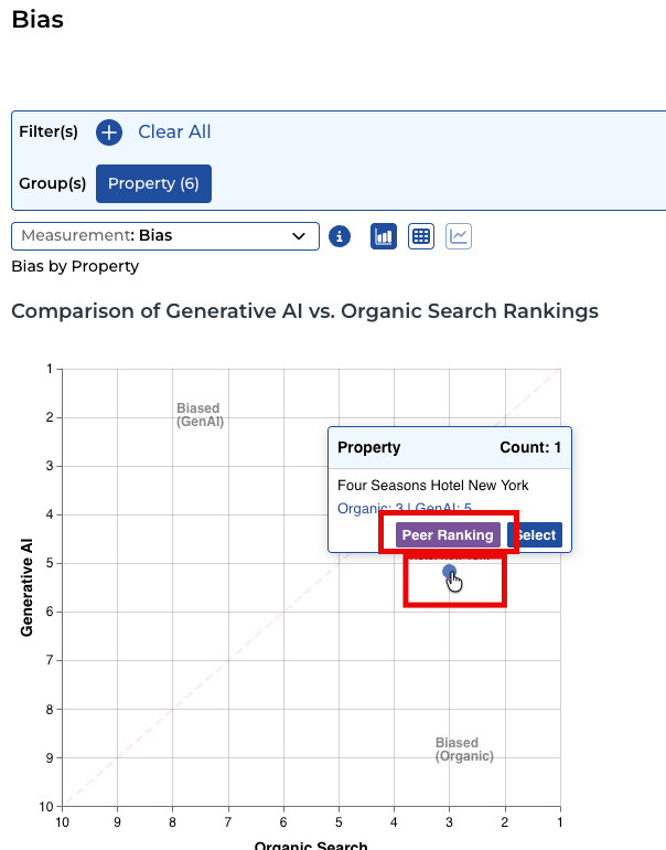
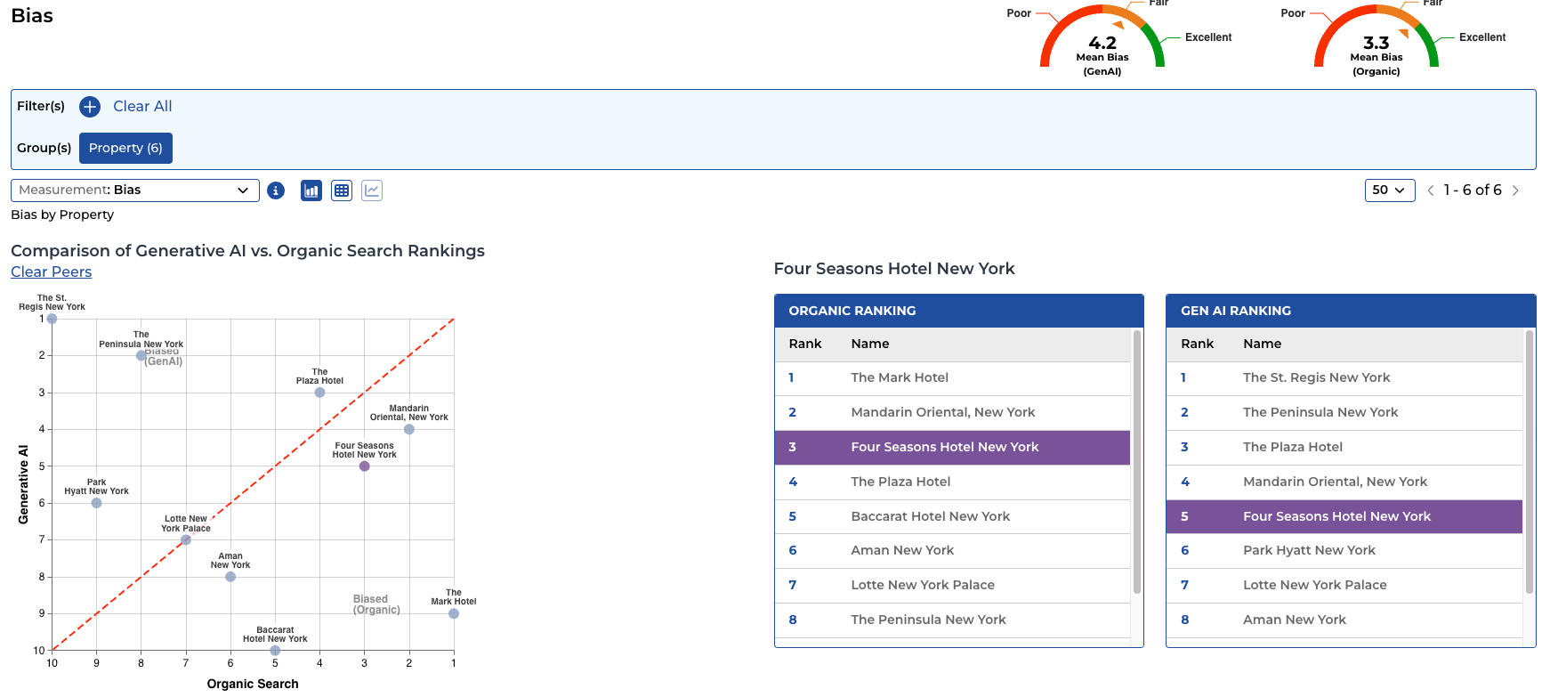
Organic Rank is sourced from SEMrush, the industry standard for search engine ranking data. The scatter graph plots each brand with GenAI Rank on one axis and Organic Rank on the other. A red dotted diagonal line divides the graph: brands above the line are healthy (GenAI rank is at least as good as organic rank); brands below the line need attention (organic rank outpaces GenAI rank — AI has not caught up with search authority).
| **Quadrant Position** | **Strategic Meaning** |
| --- | --- |
| **Top Right: Strong in Both** | Best position. Your brand leads in both traditional search and AI recommendations. Maintain through continued content quality. |
| **Top Left: High GenAI, Lower Search** | AI recommends you more than your search presence alone warrants. A positive situation — protect this advantage. |
| **Bottom Left: Weak in Both** | Neither search nor AI recommends you prominently. A broader visibility challenge requiring content strategy and aggressive curation. |
| **Bottom Right: High Search, Low GenAI** | The danger zone. You rank well in traditional search but AI is not recommending you. Growing revenue risk as travelers switch to AI-first research. |
**4.2 Understanding Bias Score Dials vs. Graph Rankings**
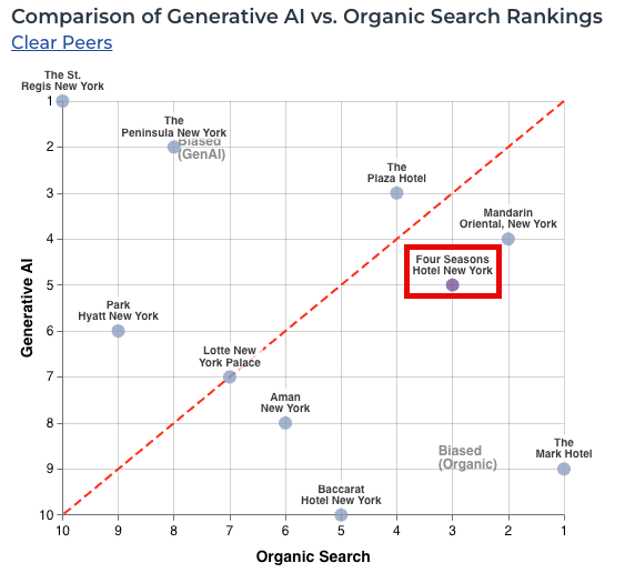
The Bias dashboard shows what appear to be different numbers between score dials and the graph/ranking tables. This is expected:
| **Dashboard Component** | **What It Shows** |
| --- | --- |
| **Score Dials (Mean Bias)** | Display the average ranking value across all five LLMs. Example: if the five platforms rank your brand 3.9, 4.4, 2.7, 3.4, and 4.6, the dial shows 3.8 (the average). |
| **Details Page** | Shows individual LLM rankings plus the calculated Global Average — the same 3.8 value shown on the dial. |
| **Scatter Graph and Tables** | Display relative positions after sorting all brands by their average rank. If your 3.8 average is the lowest in the competitive set, the graph shows #1. The graph shows positional rank, not average score. |
| **WHY THE NUMBERS LOOK DIFFERENT** Score dials show 3.8 and the graph shows #1 — both are correct. The dial is the raw average across all LLMs. The graph position is where that average places you relative to your competitive set. Both values come from the same underlying data, displayed at different stages of the calculation. |
| --- |
### **4.3 Reading the Bias Dashboard**
**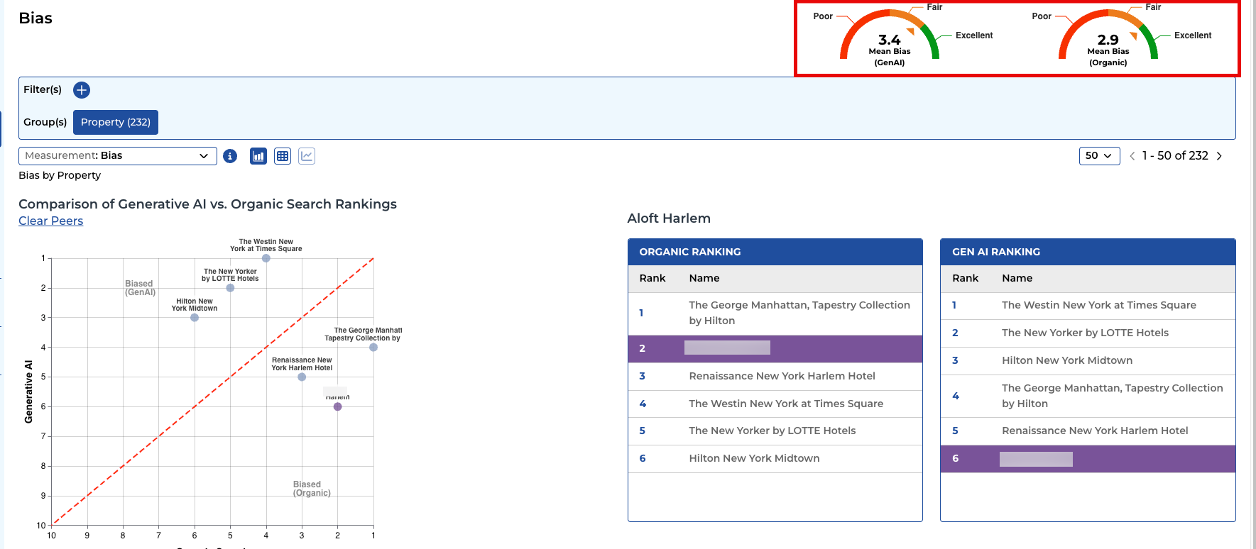**
- Portfolio-level summary showing Mean Bias for both GenAI and Organic channels
- Brand-level drill-down showing exact GenAI Rank and Organic Rank, per AI platform
- Peers comparison showing where your brand sits relative to the competitive set
- Filtering by Customer Segment — bias can differ significantly for different traveler types
- Filtering by AI Platform — bias may be stronger or weaker on individual platforms
### **4.4 Bias Insight Framework**
**Key convention:** lower rank number = better (Rank 1 = top of the competitive set). Always confirm this orientation when presenting Bias data to clients.
The most common pattern: stronger organic search rank than GenAI rank — reflecting decades of SEO investment vs. early-stage AI optimization. Curation and Orchestration close this gap over time.
#### **How to read the gap direction:**
Positive gap (GenAI rank worse than Organic rank) = AI is under-representing the brand. Most common situation — primary use case for Curation + Orchestration.
Negative gap (GenAI rank better than Organic rank) = AI favors the brand more than search. Protect this advantage — it represents AI optimization working ahead of the competition.
*Insight focus: which brands have the widest gap (most urgent Curation need), which have closed or flipped their gap, and which traveler segments show the most bias.*
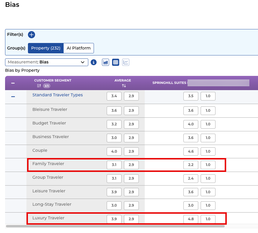
| **TRAINING INSIGHT: Segment-Level Bias** One brand showed a positive overall bias score, but when filtered to group/meeting travelers, the bias dropped significantly — revealing AI was underrepresenting the brand for that critical segment. Always filter by your most important traveler types to uncover hidden gaps. Example screenshot below shows a Limited Service hotel has a gap of -3.8 (1 organic search rank vs. 4.8 Gen AI Rank) on Luxury Travel segment but does better with their ideal customer segment of Family Travelers (1 organic rank vs. 2.2 Gen AI rank). In this example, this hotel may decide the gap in Luxury travelers are ok given it is not their target customer segment to begin with |
| --- |
- [Bonafide 101: Learn About Bonafide and AI](https://howto.bonafide.ai/bonafide-101-learn-about-bonafide-and-ai?hsLang=en-us)
- [What's New](https://howto.bonafide.ai/whats-new?hsLang=en-us)
- [Training Videos/How to Videos](https://howto.bonafide.ai/training-videos-how-to-videos?hsLang=en-us#main-content)
- [AI 101: Learn About AI and Bonafide](https://howto.bonafide.ai/training-videos-how-to-videos?hsLang=en-us#ai-101-learn-about-ai-and-bonafide)
- [Bonafide Platform Tutorial (Full Videos)](https://howto.bonafide.ai/training-videos-how-to-videos?hsLang=en-us#bonafide-platform-tutorial-full-videos)
- [Bias Module](https://howto.bonafide.ai/training-videos-how-to-videos?hsLang=en-us#bias-module)
- [Accuracy Module](https://howto.bonafide.ai/training-videos-how-to-videos?hsLang=en-us#accuracy-module)
- [Visibility Module](https://howto.bonafide.ai/training-videos-how-to-videos?hsLang=en-us#visibility-module)
- [Perception Module](https://howto.bonafide.ai/training-videos-how-to-videos?hsLang=en-us#perception-module)
- [Curator / Curation Module](https://howto.bonafide.ai/training-videos-how-to-videos?hsLang=en-us#curator-curation-module)
- [Curation / Curator Module](https://howto.bonafide.ai/curation-curator-module?hsLang=en-us)
- [Orchestration](https://howto.bonafide.ai/orchestration?hsLang=en-us)
- [Performance Module](https://howto.bonafide.ai/performance-module?hsLang=en-us#main-content)
- [Module](https://howto.bonafide.ai/performance-module?hsLang=en-us#module)
- [Bias Module](https://howto.bonafide.ai/bias-module?hsLang=en-us)
- [Accuracy Module](https://howto.bonafide.ai/accuracy-module?hsLang=en-us)
- [Visibility Module](https://howto.bonafide.ai/visibility-module?hsLang=en-us)
- [Perception Module](https://howto.bonafide.ai/perception-module?hsLang=en-us#main-content)
- [Bonafide Modules](https://howto.bonafide.ai/perception-module?hsLang=en-us#bonafide-modules)
- [Settings](https://howto.bonafide.ai/settings?hsLang=en-us)
- [Onboarding and Initialization](https://howto.bonafide.ai/onboarding-and-initialization?hsLang=en-us)
[](https://bonafide.ai)
bonafide.ai
Copyright © Bonafide 2025 Proprietary and Confidential